Shichida
UK.
Japan's whole-brain early learning method, rebuilt for British parents — three audiences, one site, a four-month clock. On 26 September 2026 the juries settled it: Winner, Site of the Day. The fee was earned. This is the file on how.
- Client
- Shichida UK
- Sector
- Early education
- Stack
- Next.js · Contentful · Famly
- The clock
- 4 months
- Status
- Settled. Fee earned.
Live at shichida.co.uk ↗ — maintained by the client's own team.
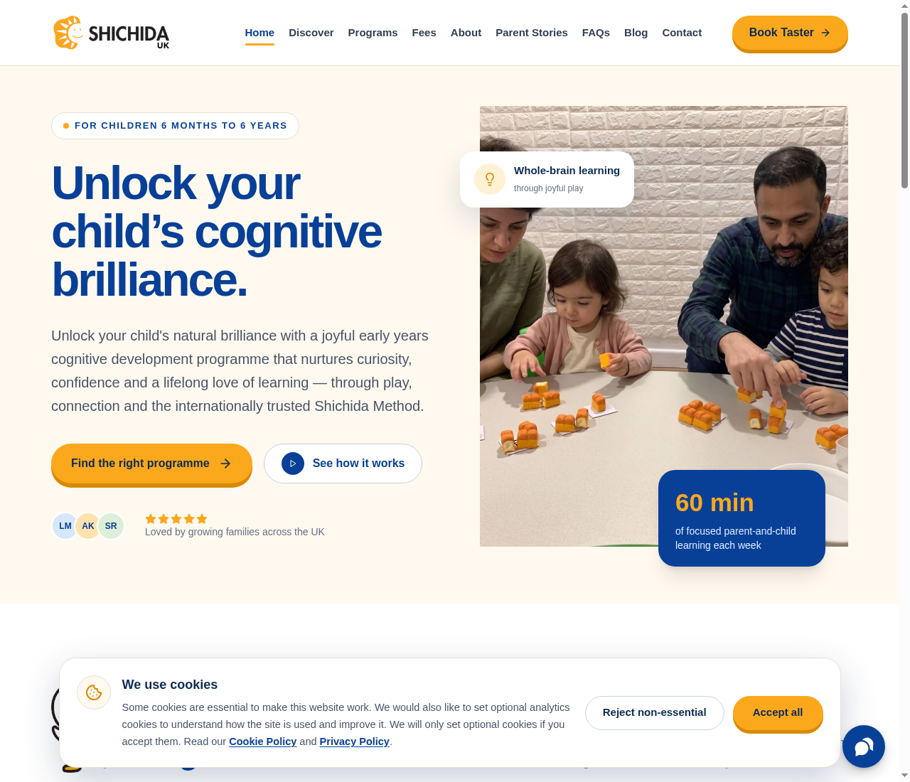
Three
audiences,
one site
The previous presence had grown fragmented and difficult to maintain — the polite way of saying it had stopped serving anyone. The redesign brief came down to three readers with nothing in common except the same URL.
The prospective family
They have never heard of whole-brain learning. They arrive anxious, price-aware and thirty seconds from leaving. The site has to explain a fifty-year-old Japanese method — the “Education of the Heart” — without jargon, and make “22 focused minutes a week, together” feel like something they can actually do.
The enrolled parent
They already pay. They need a resource hub, not a brochure: programme details, developmental guidance, and a blog that keeps moving. A site that serves only the sale insults the people who already bought.
The business
The site has a commercial job: trial bookings and enrolment. That job has to be done without the page ever feeling like a funnel, because the reader is making a decision about their child, not about a subscription.
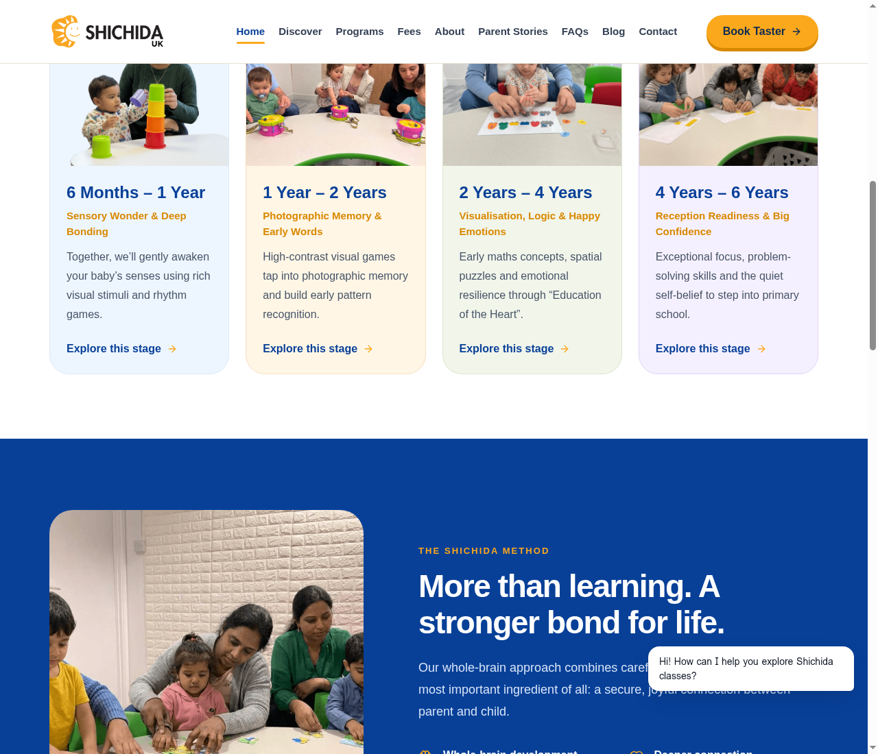
The journey is the child's age, not the product catalogue
Parents do not think in SKUs; they think “my daughter is twenty months.” So the programmes are organised as four stages from six months to six years — sensory bonding, photographic memory, visualisation and logic, school readiness — each explorable in one swipe. The structure is the empathy.
The philosophy is explained before anything is sold
Whole-brain learning sounds like a claim; the site's job is to turn it into a method. Dedicated pages walk through what the Shichida Method is and how a class actually runs, so the booking button is an informed decision rather than a leap of faith.
Warmth inside a system
Say “playful but credible” to a room of designers and it produces gradients and rounded corners. Instead: a disciplined grid and typographic hierarchy doing the credibility work, with the colour, the micro-interactions and the Shichida Duck doing the warmth. Playful is a layer, not a structure.
The taster booking is never more than one tap away
Every section resolves to the same quiet action — book a free taster — wired straight into the nursery's Famly enrolment flow. No forms that vanish into an inbox. The conversion path is short enough that an anxious parent completes it one-handed.
The client edits everything
The hub runs on a CMS the client's own team operates: new guidance and blog posts land weekly, without us. A site that needs its studio for every update is a site that is already dying — and a dying site does not win juries in month four.
7.50,
itemised
Web Design Awards publishes its seven criteria, so the win can be itemised rather than celebrated. Read the order of these numbers: the two highest scores are the two categories with no taste in them.
That is not a coincidence. It is the method — the floor first, the personality second — expressed as decimals.
What we would do differently
User experience scored 7.10 — the lowest number on the sheet. The programme explorer earns its keep on desktop and asks a little more of a tired thumb on mobile; the next iteration tightens that path. Visual design at 7.20 says the jury found the work coherent rather than boundary-pushing — arguably correct for a site read by anxious parents, and noted all the same. A studio that publishes its rubric homework does not get to skip its own.